
The Art of the Gothic Quill: Behind the Scenes of Macabre Manuscript Creation
In the dim glow of a flickering candle, a single feather scratches across rough paper. Shadows stretch long on the walls, and the air feels thick with secrets. This is the world of Gothic quill work, where every stroke builds a mood of mystery and unease. Gothic style isn’t just about ghosts or crumbling castles—it’s a careful craft that shapes words into something alive and haunting. This piece pulls back the curtain on how these dark manuscripts come to life, from the tools you hold to the thoughts that guide your hand. We’ll explore the steps, the gear, and the spark that makes Gothic art endure, even in today’s films, books, and designs that nod to the past.
The Essential Toolkit of the Gothic Scribe
Crafting a Gothic manuscript starts with the right supplies. You can’t rush this part. It’s like building a haunted house—one wrong board, and the whole thing creaks wrong.
The Preferred Medium: Parchment vs. Vellum
Parchment comes from animal skins, stretched and scraped until smooth. Back in the Middle Ages, scribes chose it for its toughness; it lasted through wars and fires. Vellum, a finer type from calfskin, holds ink without bleeding, giving that crisp edge to Gothic lines. Both materials soak up the dark tones just right, creating shadows that pull you in. Their rough touch adds to the old-world feel, far from smooth modern paper.
Today, you can find high-quality substitutes at art shops or online. Look for cotton rag paper with a textured finish—it mimics the bumps without the hassle of real skin. Try brands like Arches or Fabriano; they age well under ink. For true authenticity, source faux parchment from specialty suppliers. Start with a small sheet to test how your quill glides.
Tip 1: Soak paper in weak tea for a yellowed look before writing.
Tip 2: Store sheets flat in a cool, dry spot to avoid curls.
Tip 3: Handle with cotton gloves to keep oils off the surface.
These choices make your work feel timeless, like pages from a forgotten abbey.
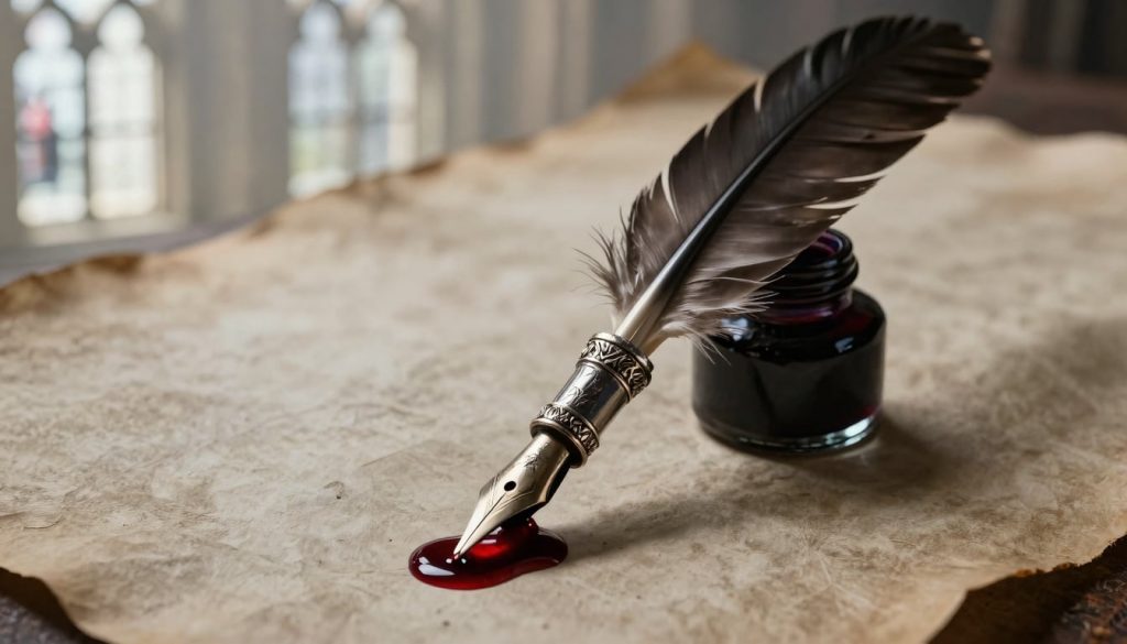
Ink Alchemy: Achieving True Blackness
Old scribes mixed iron gall ink from oak galls, iron salts, and gum arabic. This brew reacts on the page, turning deep black over time—perfect for the stark contrasts in Gothic tales. The colour doesn’t fade; it grows richer, much like a secret unfolding.
Modern Gothic calligraphers grab archival inks from brands like Winsor & Newton. These hold up without the mess of homemade batches. Most prefer a matte finish for that subtle depth, though some add a glossy sheen for highlights on capitals. Why black? It mirrors the void in Gothic stories, where light fights darkness.
Historical fact: Iron gall ink powered the Magna Carta in 1215.
Modern swap: Use Speedball India ink for quick tests—it’s fade-proof and flows smooth.
Mix your own if you dare: crush galls, add vinegar, and stir in iron. But wear gloves; it stains like sin.
The Instrument of Creation: Selecting the Right Quill
Feathers from geese offer flex for thick-to-thin lines, ideal for dramatic Gothic flourishes. Swan quills give a broader stroke, suiting bold titles. Turkey feathers hold up longer for long sessions, resisting splits under pressure. Each bird’s gift shapes the script’s flow, turning flat words into waves of shadow.
To prep a quill, pick a strong feather and strip the barbs with a sharp knife. Score the tip at an angle, then slit the centre for ink flow. Hone the nib on a stone for a fine point—too blunt, and your letters blob. This penna knife, often a simple blade, becomes your trusted tool.
Here’s a quick guide:
Soak the feather in warm water for 10 minutes to soften.
Cut the tip square, then bevel the edge at 45 degrees.
Test on scrap paper; adjust until lines vary with pressure.
With practice, your quill dances like a ghost in the night.
Mastering the Script of Shadow and Structure
Once your tools are set, the real magic begins. Scripts aren’t just letters—they’re structures that echo cathedrals and crypts. You build them stroke by stroke, layer by layer.
Unlocking Blackletter: Textura Quadrata and Rotunda
Blackletter scripts define Gothic writing, with their tall, narrow forms. Textura Quadrata stands rigid, like stone buttresses on a church—each letter a block of vertical strength, topped with diamond points that catch the eye. Rotunda softens the edges with curves, easing the read while keeping that medieval bite.
Picture Textura’s ‘A’: two uprights frame a crossbar, terminals sharp as thorns. Rotunda’s loops flow like vines in a graveyard. Both demand steady hands for uniform height, creating walls of text that trap the reader.
Why master these? They turn prose into architecture. Start with grid lines on your page to guide the ascent.
The Power of Punctuation and Spacing
Gothic pages pack tight, with little room to breathe. Scribes added points and virgules—early commas—to break the flow without much space. This density builds a sense of press, like walls closing in on a trapped soul.
Readability came from rhythm: short pauses amid the crush. Negative space? Sparse, it heightens focus on key words, much like spotlights in a dark theatre. Modern punctuation evolved from these marks, but Gothic scribes favoured implication over dots.
Think of it this way—too much air dilutes the mood. Use wider gaps only for emphasis, like after a chilling reveal.
Embellishment: Illuminated Capitals and Marginalia
What starts as plain script blooms with colour and creatures. Illuminated capitals burst with gold leaf and lapis blue, drawing eyes to chapter starts. Marginalia—doodles in the edges—feature twisted vines, grinning demons, or family crests, adding whimsy to the gloom.
Take The Book of Kells, an Irish gem from around 800 AD. Its pages swirl with Celtic knots and beasts, turning Bible verses into a feast for the eyes. Or Très Riches Heures du Duc de Berry, a 1410s calendar alive with nobles and monsters in the borders.
To try it:
Sketch motifs in pencil first.
Layer watercolours or gouache for vibrancy.
Burnish gold with an agate stone for shine.
These touches make your manuscript a portal, not just a page.
The Mindset: Cultivating the Gothic Atmosphere
Tools and techniques matter, but your headspace seals the deal. Gothic quill art thrives on mood—slow, steeped in the eerie.
Researching the Macabre Canon
Dive into Poe’s ravens or Shelley’s storms to fuel your style. These tales shape how you curve a letter or shade a shadow. Walpole’s Castle of Otranto kicked off the genre in 1764, blending ruin with romance.
History adds grit: the Black Death in 1348 sparked morbid art, while church schisms bred doubt in ink. Grasp this, and your work echoes real fears. Read originals under lamplight; let the words haunt you.
The Ritual of Creation: Slow Art in a Fast World
Rushing kills the vibe. Slow strokes build tension, mirroring the creep of dread in a good ghost story. In our quick-scroll days, this patience yields pieces that stand out—raw, real.
Set up a nook with low lamps and velvet drapes. Play soft chants or wind howls for immersion. Work at dusk; the fading light sharpens focus.
Tips for your space:
Dim bulbs to 40 watts max.
Burn beeswax candles for scent and flicker.
Keep a thesaurus nearby for shadowy synonyms.
This ritual turns crafting into a spell.
Battling the ‘Sins’ of the Scribe: Imperfection as Art
Blots and smudges? In old tomes, they add soul—like scars on a warrior. Embrace them; they prove human touch over machine perfection. But know the line: a deliberate rub for age differs from sloppy haste.
Historical books wear from thumbs and time, pages foxed and frayed. Mimic with sandpaper or coffee stains, but lightly. Imperfection invites the viewer closer, whispering of lives long gone.
Modern Interpretations and Digital Echoes
Gothic quill work lives on, twisted for now. Artists blend old ways with new tricks, keeping the chill alive.
The Gothic Revival in Contemporary Calligraphy
Today’s scribes swap feathers for steel nibs in dip pens, like those from Speedball. They capture flex without the prep, ideal for custom invites or book covers. The feel stays close—ink dips, strokes vary.
Meet Gina Hensel, a US artist reviving Blackletter for tattoos and art. Her studio in Brooklyn churns out pieces that blend medieval might with street edge. Check her site for workshops; she’s taught thousands the quill’s whisper.
This revival proves Gothic quill art adapts, thriving in weddings and horror zines.
Digital Gothic: Fonts and Texture Mapping
Pixels struggle to match parchment’s bite. Fonts like Cloister Black ape Blackletter, but lack the nib’s bite and ink’s pool. Texture overlays help—scan real pages, map bumps in Photoshop.
Yet hand work wins for heart. Digital feels flat, missing the tremor of a shaky hand. Why? Emotion bleeds through the physical. Use software for drafts, quills for finals.
Conclusion: Leaving the Lasting Mark
Gothic manuscript creation weds strict skills to a brooding air. From quill cuts to marginal monsters, each bit crafts unease that lingers. We’ve traced the tools, scripts, mindset, and fresh spins on this dark art.
Key takeaways? Grab quality parchment swaps and iron-rich inks for depth. Master Textura’s towers through practice grids. Embrace slow rituals in dim corners, and let blots be your badges. Dive into Poe or plague lore to spark your style. With patience and a nod to history’s shadows, you can wield the Gothic quill too. Pick up a feather today—etch your own tale of twilight.
The Gothic Quill


Leave a Reply